Marketing blues (and reds and greens): Does the color you use make a difference in marketing?
 There is a whole psychology behind using color in marketing.
Some would say that certain colors make you hungry, while others suppress your
appetite. Certain colors are symbolic of strength and stability and others
evoke emotions, such as happiness. Does color really make a difference in
marketing?
There is a whole psychology behind using color in marketing.
Some would say that certain colors make you hungry, while others suppress your
appetite. Certain colors are symbolic of strength and stability and others
evoke emotions, such as happiness. Does color really make a difference in
marketing?
To be sure, certain colors stand out more than others. If
you are competing for the instant attention of your target market, using a
color that catches your eye would be a great advantage, such as a product on a
crowded shelf at a retail business. Warm colors (those built with reds, yellows
and combinations of the two, such as orange) tend to appear to proceed or
advance to you, while cool colors (blues, greens and dark purples) appear to recede
and regress. For that reason, many logos are designed with warm colors.
But there is more to consider than just warm and cool
colors. For instance, look at the graphic I designed and used nine different
colors. The top row is made of cool
colors, the middle row of warm colors and the bottom row of neutral colors.
Which colors stand out the most to you? My guess is you will say that two of
the colors stand out the most and neither are warm colors. If you think the
purple in the top right corner and the black in the lower right, there are two
color components at work to draw your eye. These are density and contrast.
Color is impacted greatly by the color of its surroundings. The wider the
density value difference between the two, the greater the contrast. Black is as
dense as you can get with color. White is as light as you can get. The contrast
between the two is the greatest in value separation. Contrast draws our eye.
Take a look at this next chart, showing black and white contrast, from very
dense black to very light grays.

Likewise, now take a look at the graphic with black and
color. 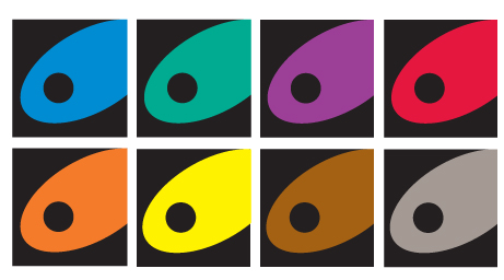 Now which stand out the most? My guess is you are thinking the black and
yellow combination stand out more than the others. That all has to do with the
value of the two colors contrasted against each other. When the yellow was
contrasted against white in the top illustration, it all but disappeared. Here
is the point, if you want your marketing to work, you have to build a brand
with a lot of contrast.
Now which stand out the most? My guess is you are thinking the black and
yellow combination stand out more than the others. That all has to do with the
value of the two colors contrasted against each other. When the yellow was
contrasted against white in the top illustration, it all but disappeared. Here
is the point, if you want your marketing to work, you have to build a brand
with a lot of contrast.
Now, let’s consider what brand this graphic is representing.
Different colors convey a mood. If this were a logo, what colors would you use
if it were representing these brands:
·
An organic asparagus farm
·
A bank
·
A delivery service
·
A power drink
·
A jewelry store
·
A tennis club
Does color in marketing matter? Yes it does! Consider what
you are trying to convey about your brand to your customers and align the
colors you use with your marketing message.