 Your logo is the symbol of your business brand. It is really
important that when someone sees your logo, they recognize it and associate it
with what you are selling. Let me ask you a question: What is the life span of
a logo? When is it time to change it? That may depend upon who you are asking.
Your logo is the symbol of your business brand. It is really
important that when someone sees your logo, they recognize it and associate it
with what you are selling. Let me ask you a question: What is the life span of
a logo? When is it time to change it? That may depend upon who you are asking.
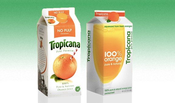
Several years ago, Tropicana Orange Juice decided to
redesign their logo. They felt like the iconic straw stuck in an orange had run
its course and needed a more modern feel. They paid $35 million to redesign the
logo and their packaging. The new idea was a flop. Their customers hated the
new logo and sales dropped 20 percent. Tropicana got the message and two months
into the launch of the new design, they reversed course and brought back the
old logo.
However, compare that to another drink (and the parent
company of Tropicana), Pepsi. The Pepsi logo has changed five times in the past
20 years. That is quite often for a major brand. The most recent change
happened in 2009. Notice that some of the elements of the logo, like the colors
and the wave running through a circle have not changed. But fonts and the shape
of the wave have gotten a facelift. 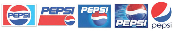
So when should you stay the course with your logo and be
like Tropicana and when should you change it and be like Pepsi? The reasons may
have less to do with design aesthetics and more to do with changes within
markets. The first reason is to appeal to a new target market. You may be
expanding geographically or you may be trying to attract business from another
demographic group. For years, Pepsi has been competing head to head with Coca
Cola, but in recent years, carbonated drinks have seen shrinking markets
because there are more choices of drinks (such as energy drinks, sports drinks,
and bottled water) that have cut into their sales. Plus, there is the attack on
carbonated drinks being tied to health concerns and Millennials have strong
opinions about healthy food. Much like the tobacco industry was targeted as
unhealthy by its critics, the same argument has been levied on soda beverages.
Pepsi has changed its logo to appeal to a younger, hipper audience. It has also
launched new products to appeal to the calorie and pure food conscious.
Products like Pepsi Max with no calories to Pepsi Next with 60 percent less
sugar than regular Pepsi, to Pepsi True with no artificial sweeteners and 30
percent less sugar, to their latest launch: 1893 Original Cola with 100 percent
sugar and a bolder cola taste – all are made to appeal to a new audience. The
logo gets stretched rather thin when it has to carry this many different
brands. Look for a new logo from Pepsi if any of these new products begin to gain
traction with the younger set.
 Another good reason to change your logo is to make it more
technically correct. You may have noticed that Google changed their logo font
in the past year. The reason had to do with rendering the font on web-based
formats. The new sans-serif font renders better than the old Roman serif font.
It used to be we looked at logo fonts from the perspective of the printed page.
Now they are judged by how well they render and are read on a screen.
Another good reason to change your logo is to make it more
technically correct. You may have noticed that Google changed their logo font
in the past year. The reason had to do with rendering the font on web-based
formats. The new sans-serif font renders better than the old Roman serif font.
It used to be we looked at logo fonts from the perspective of the printed page.
Now they are judged by how well they render and are read on a screen.
A third reason to change your logo has to do with color.
Color comes and goes out of fashion. We associate decades with color schemes
(lime green and orange takes me back to the 1960s, earth tones remind me of the
1970s, pastels land me in the 1980s, and burgundy and teal sends me to the
1990s). Right now neutral colors, especially grays, are all the rage. You can
change the color of your logo without changing the design. However, the
timeless colors tend to be those who are from the primary palate. Reds and
blues are most prominent. Greens and oranges are secondary palate colors that
also have staying power. All other colors will come and go out of style. Make
sure whatever your color scheme is, it needs to stand out and have good
contrast to be readable. Take a look at my previous article: Back to the
basics: Effective logo design.
The fourth reason to change your logo is it has never
resonated with your customers or potential customers. Here is a little test. If
you strip out the name of the business and just leave the graphic elements of
your logo, would anyone recognize it? Here are several well-established logos.
See how many you know by just their graphics.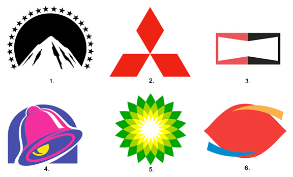
Here are the answers to the blank logos above:
1. Paramount Studios, 2. Mitsubishi Motors, 3. Champion
Spark Plugs, 4. Taco Bell, 5. British Petroleum (BP), 6. Dairy Queen