What makes an effective logo? The easy answer is it
is memorable. At a glance you should be able to recognize the brand it
represents. Whether you have a wordmark logo (where the whole logo is just a
specific font without graphics – think FedEx) or you have a true trademark
(where an image represents your brand – think Nike swoosh), or a combination of
both, people should recognize your company in a split second.
How do you put together a logo that people will
remember? What makes one logo stand out above another? Let’s talk first about
design. The biggest mistake you can make with a logo is to make it too
complicated. When the artwork is too complex, it is too much information for
our brains to decipher at a glance. In logo design, the simpler the better.
When you look at the way logos have changed over time, especially with very old
brands, you will notice that they have simplified their visuals over time. Take
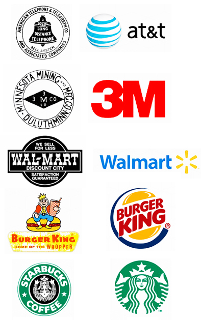
a look at the logos above. In the left column are very early logos for the
companies, with the most recent logo in the right column. The top two logos for
AT&T and 3M are over 100 years old. Walmart and Burger King logos are a bit
newer. The Walmart logo is from 1960s and the Burger King sitting atop the logo
is from the 1950s. Starbucks is much newer. The left logo is from 1992.
Obviously logos have changed over the years, but you can see that regardless of
the year they were designed, the one consistent design element is that now they
have all been simplified.
One big mistake companies make when designing a
logo is to describe everything that the company stands for in its logo. That is
putting a lot on one image. Notice that none of the current logos tell us with
words what they make, with the exception of Burger King, since it is part of
the brand name. The original logos all tried to tell us with words what the
brand was supposed to be. The top three logos in particular are so cluttered
that you could never read all of that information at a glance. And when you
cannot recognize it in a glance, the logo becomes less memorable. In time, the
wordiness has been stripped away. Even the Starbucks logo has dropped the name
of the company and the product. The graphic is strong enough on its own for
people to recognize the logo as the
Starbucks brand. Now you might be thinking, "of course people recognize a
modest graphic. These companies are household names and can get away with a
simplified logo.” You might have a point, and there is nothing wrong with
putting words in a logo. But you have to ask how these brands got to the point
that their logo is so recognizable. It works the same way regardless of the size
of your company. Simple is memorable, dozens of details are not.
The other thing I want to recognize with the new
logos is the use of bold graphics and color. There are no fine lines. There is
also a good use of white space to contrast against a solid primary color. All
of the fonts used are sans
serifs (without the small lines at the top and feet of
characters, like is used in Roman fonts). This again is keeping it all easy on
our brains to distinguish when we whisk past a logo and catch it out of the
corner of our eye.
 The other piece of making a logo effective is to
use it often. The point of a logo is to help your brand be recognized, not to
make perfect sense in the mind of the viewer. The more you use it, the better
your chances of a memorable logo doing its job. Let me explain. Many times
corporate logo design comes with a committee of people who all have different
ideas on how it should look and what it should represent. Often logo design by
committee ends up being a conglomeration of all ideas, which makes it much too
complicated to be memorable. There is a tendency in these committees to
overthink the logo. Logos do not necessarily have to make perfect sense with
the brands they represent. Think of the classic three-pointed logo for car
maker Mercedes-Benz. That logo has changed very little since it was first used
in 1910. Do you know what the three points are representing? The original
designer had in mind that they would represent the Mercedes commitment to
building transportation for air, land and sea. If I had to guess, you thought
it had to do with a hippy peace symbol. However, what it really
represents is neither of these. What it represents is a classy car – nothing
more and nothing less. The reason we associate it with high-end automobiles is
that it has been used extensively in that manner for 115 years. We cannot
escape it. The same will be true of your logo. Design it and use it. People
will make the association when they see it enough that it registers in their
brains.
The other piece of making a logo effective is to
use it often. The point of a logo is to help your brand be recognized, not to
make perfect sense in the mind of the viewer. The more you use it, the better
your chances of a memorable logo doing its job. Let me explain. Many times
corporate logo design comes with a committee of people who all have different
ideas on how it should look and what it should represent. Often logo design by
committee ends up being a conglomeration of all ideas, which makes it much too
complicated to be memorable. There is a tendency in these committees to
overthink the logo. Logos do not necessarily have to make perfect sense with
the brands they represent. Think of the classic three-pointed logo for car
maker Mercedes-Benz. That logo has changed very little since it was first used
in 1910. Do you know what the three points are representing? The original
designer had in mind that they would represent the Mercedes commitment to
building transportation for air, land and sea. If I had to guess, you thought
it had to do with a hippy peace symbol. However, what it really
represents is neither of these. What it represents is a classy car – nothing
more and nothing less. The reason we associate it with high-end automobiles is
that it has been used extensively in that manner for 115 years. We cannot
escape it. The same will be true of your logo. Design it and use it. People
will make the association when they see it enough that it registers in their
brains.
If your current logo needs to be updated, keep in
mind that to make it memorable, the design has to be simple. Make the graphics
bold and the colors contrasting so that it can be seen at a glance. Keep the
words to a minimum or do not use them at all. The logo does not have to make
perfect sense to be effective – it just has to be used. The more you use it,
the more it will be remembered.