 During the War of 1812, a New York meatpacker named Samuel
Wilson was supplying barrels of meat to the U.S. military. He marked each
barrel with a U.S. stamp. The soldiers in the field began to speculate what the
initials U.S. stood for. When it was learned that the meatpacker’s name was
Samuel, the soldiers began to joke that it stood for Uncle Sam. The joke spread
and soon the United States had its own brand image. That image was later
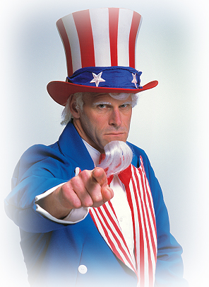
enhanced by 19th century political illustrator, Thomas Nast. Nast
became famous for popular imagery that captured the attention of the general
public, such as a donkey and an elephant as the symbols of the Democrat and
Republican parties. He turned Uncle Sam into a tall, white-bearded old man all
decked out in the stars and stripes. In both word and imagery, Uncle Sam has
successfully been associated with the United States federal government.
During the War of 1812, a New York meatpacker named Samuel
Wilson was supplying barrels of meat to the U.S. military. He marked each
barrel with a U.S. stamp. The soldiers in the field began to speculate what the
initials U.S. stood for. When it was learned that the meatpacker’s name was
Samuel, the soldiers began to joke that it stood for Uncle Sam. The joke spread
and soon the United States had its own brand image. That image was later
enhanced by 19th century political illustrator, Thomas Nast. Nast
became famous for popular imagery that captured the attention of the general
public, such as a donkey and an elephant as the symbols of the Democrat and
Republican parties. He turned Uncle Sam into a tall, white-bearded old man all
decked out in the stars and stripes. In both word and imagery, Uncle Sam has
successfully been associated with the United States federal government.
How well is your business branded? How about the products
and services you provide? Do people recognize them, both in name and imagery,
and understand instantly what you are all about? Think about the names of these
six businesses:
CVS
Sherwin-Williams
Amazon.com
Old
Navy
Lowe’s
Target
Let’s find out how well these companies have done in brand
awareness with you. Answer the following questions.
- Can
you name what each of these companies sell? (Notice I did not select
companies that gave you any clue to their sales offerings in their name,
such as PetSmart, Bed, Bath and Beyond, or Toys ”R” Us.)
- Can
you describe the colors used in their logos?
- Could
you describe or draw a quick sketch of their logo, including any shapes or
images?
These corporations have spent tons of money making you aware
of their brand. Let’s break down what successful branding awareness looks like.
First, do you have a memorable logo? Unlike fine art, logos are very simple,
not complex. They are meant to be viewed and recognized at a glance, not stared
at and studied on the walls of a museum. The colors are most often primary or
secondary colors (red, blue, and sometimes yellow, orange, green, purple).
There are only a few exceptions to this rule. They have to have a high degree
of contrast (that is why yellow is not often used in logos unless it is next to
a very dense color, such as black.) Contrast is what helps your eye make a
quick distinction between one form and another. In other words, it aids with
the quick recognition of the logo at a glance. The colors you use and the
degree of contrast are two crucial components of making your logo memorable.
This is the first leg of logo recognition. The second leg is a simple, but appealing piece of artwork. That would include the fonts that are used in the logo
and any imagery, such as shapes, graphics or illustrations. For instance, if you have a duck flying in a triangle with
the name of your company underneath, make sure it is bold and not subtle. You
should consider a silhouette of the bird in the triangle rather than a line
drawing that details every feather. The font should be easy to read. Many
script and decorative fonts do not make good logos. The third leg is a name
that is catchy and easy to remember. In our example above, could you tell me
what CVS stands for? It is short for Consumer Value Stores, a name which is not
so memorable. The three letters – CVS - are much easier to remember. CVS could
stand for any number of businesses. So could any of the examples we gave above.
Notice that the name does not have to make total sense; it just has to be short
and appealing. It might make more sense if Target were an archery store. Old
Navy sounds like a military surplus store. That is the beauty of branding. When
it is working well, people don’t assign logic to your name. They just know who
you are and what you are selling at the mention of your name.
Successful branding goes beyond the logo design. It also
reflects who you are as a corporation. It conveys the way you want the consumer
to remember you. For instance, Nordstrom and Walmart both sell apparel. Is
there a difference in the clothing you would purchase at each store? Yes,
absolutely. Is that reflected in their brands? Yes it is. Nordstrom has built
their brand on high end designer clothing and exceptional customer service. I
can get a personal stylist as a consultant at Nordstrom who will take my
measurements and, with one quick call, will pick out a suit for me, have it
tailored and delivered to my office. Nordstrom has built their brand around
out-servicing their competition. Are they the cheapest price in the market? No,
but they don’t want to be branded as the cheapest, they want to convey a level
of sophistication and high-end customer service. Walmart has been branded in a
much different way. Their current slogan is "Save money. Live better.” They
have branded themselves to be the place you go to get the lowest price. Their
version of customer service is being greeted at the door with a smile and a
shopping cart. From there on, you are on your own in a do-it-yourself shopping
experience. There are no frills, no personal consultants to help you pick out
just the right piece of clothing. It reflects a very distinct brand image that
Walmart conveys very well. They are the place to come when you want to make
your dollars stretch as far as they can. Again, notice the simplicity of each
message. That is all wrapped inside your company’s brand.
If you need to re-brand yourself, first take into
consideration what you are trying to say. Don’t get too complicated with the
message. If you could only get one message out to your potential clients, what
would you say? Build your brand around this statement. Build an image that
stands for that statement as well. Keep it catchy and keep it simple.
Here are the answers to the questions about the six
businesses.
1. CVS – is a pharmacy. Its logo is red. The logo has a
diagonal slash between CVS and pharmacy. Here is a link to the CVS logo.
2. Sherwin-Williams – is a paint retailer. Its logo is red
and blue. It has a paint can pouring over the top of the globe with the words
"Cover the Earth” in the middle of the globe. Here is a link.
3. Amazon.com – is an online retailer, namely of books,
videos and electronics. Their logo is black letters with a gold curved line
that resembles both a smile and an arrow to perform a click. Take a look.
4. Old Navy – is a discount clothing store appealing to
young families. The logo is blue in an oblong oval. Click here for a look.
5. Lowe’s – is a big box home improvement store. The logo is
blue and is in the shape of a house. Take a look.
6. Target – is a discount department store. The logo is a
red target. See it here.
__________________
Sep 7, 1813: United States nicknamed Uncle Sam, This Day in History, History.com
Photo by Kate Philips